
Giving a Global Name Sharper Communication for the Indian Market

Saint-Gobain India had the advantage of a trusted global name, but its local communication system needed a sharper, more contemporary expression. Packaging, brochures, exhibition materials, and digital touchpoints had to feel unified, premium, and easier to understand, without drifting away from established global standards. ID8NXT refreshed the design language into a modern, functional visual system, bringing clarity to packaging, polish to brochure design, stronger structure to exhibition communication, and a more consistent brand presence across every customer-facing format.
Saint-Gobain already carried the weight of global credibility, but its visual communication in India wasn't always translating that strength into immediate customer impact. Across print, packaging, exhibition, and digital platforms, the design language needed to feel more integrated, more functional, and more engaging, with every touchpoint expected to explain faster, look more premium, maintain technical clarity, and stay aligned with international identity guidelines. The brief was a balancing act: modernise the experience without losing brand discipline, make communication more engaging without making it noisy, and build a system that could sell trust, product performance, and brand value at a glance.
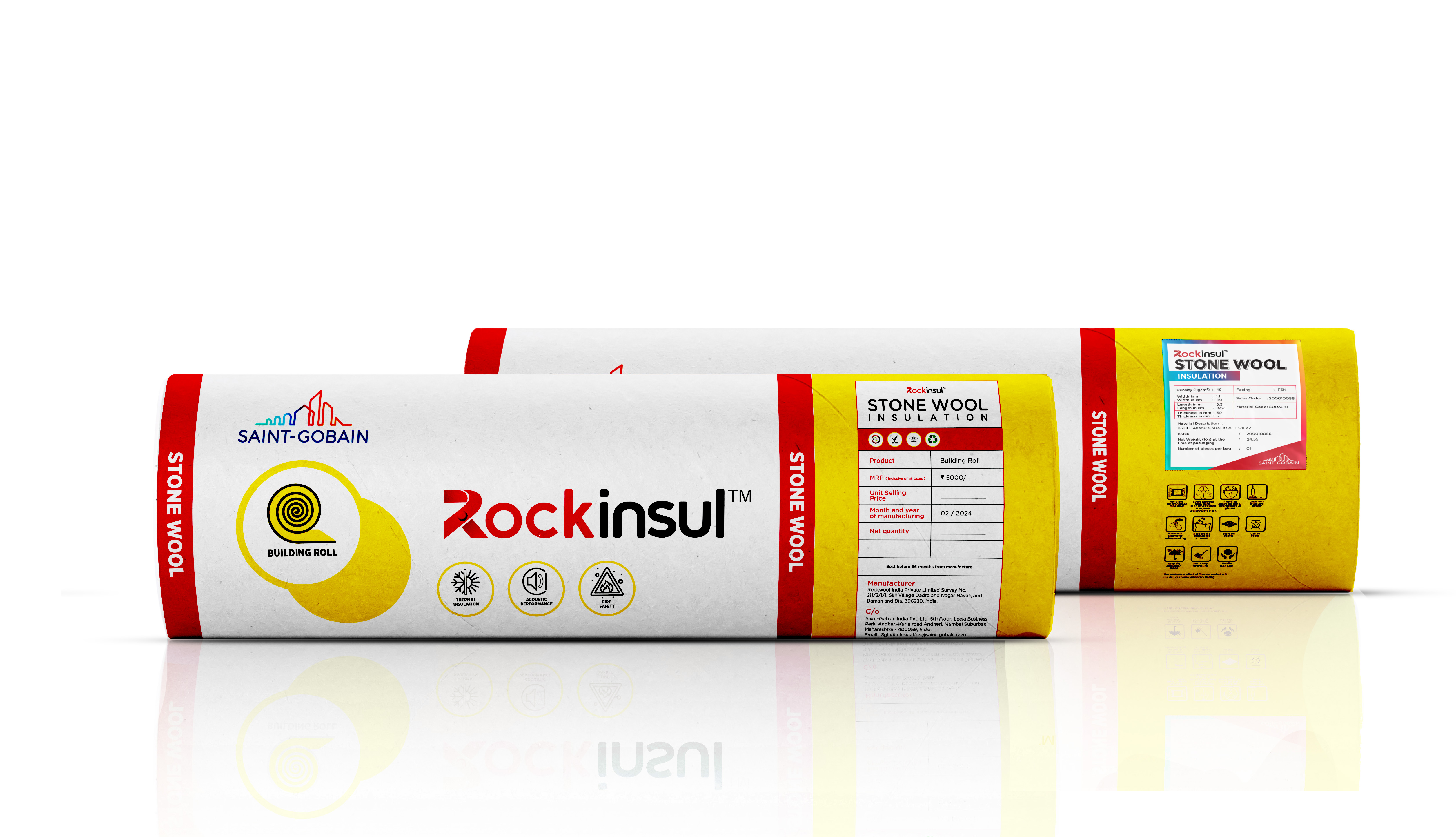
We treated the project as a system, not a set of isolated design outputs. Every asset had to speak the same brand language while doing a different job. Packaging needed shelf clarity and product confidence. Brochures needed structure, flow, and a more polished presentation of information. Exhibition and digital touchpoints needed to extend that same visual rhythm into larger, more interactive environments.
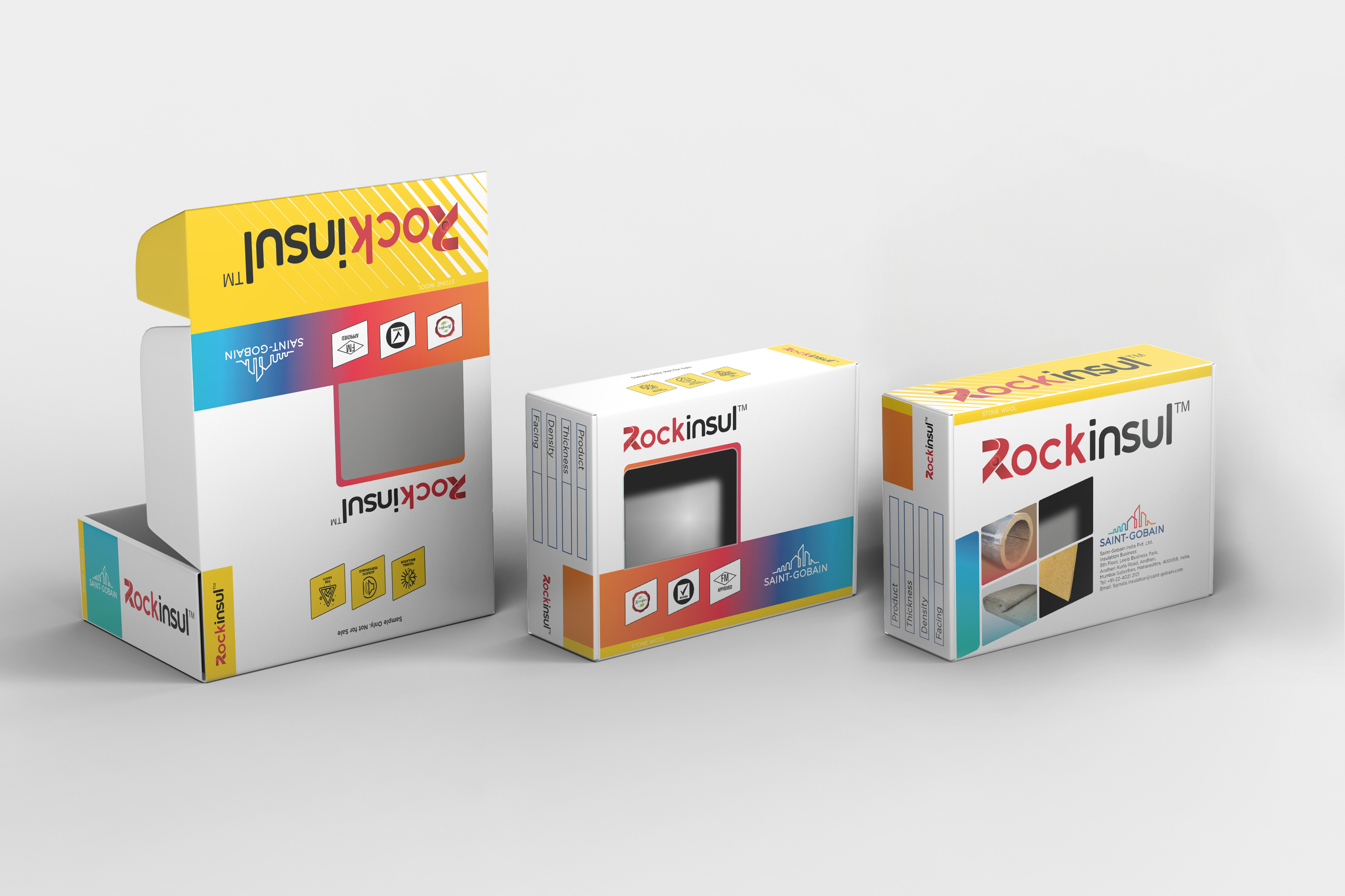
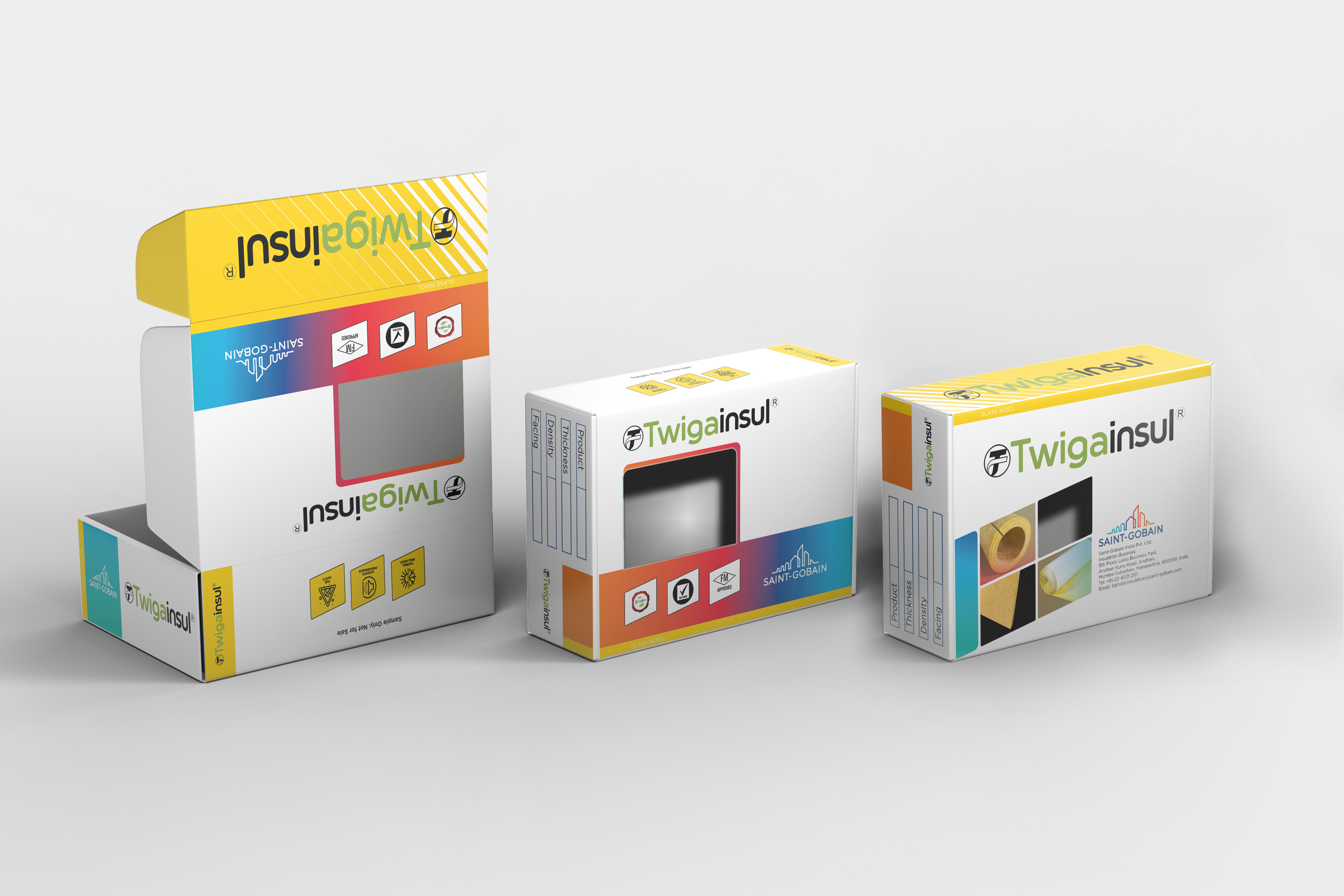
The approach focused on hierarchy, layout balance, typography, presentation aesthetics, and brand consistency. Creative direction stayed refined and restrained, letting Saint-Gobain's product strength and global credibility lead while giving every touchpoint a fresher, sharper presence, from product boxes and cylindrical packs to brochure spreads and digital-ready presentation assets that could move fluidly across formats.
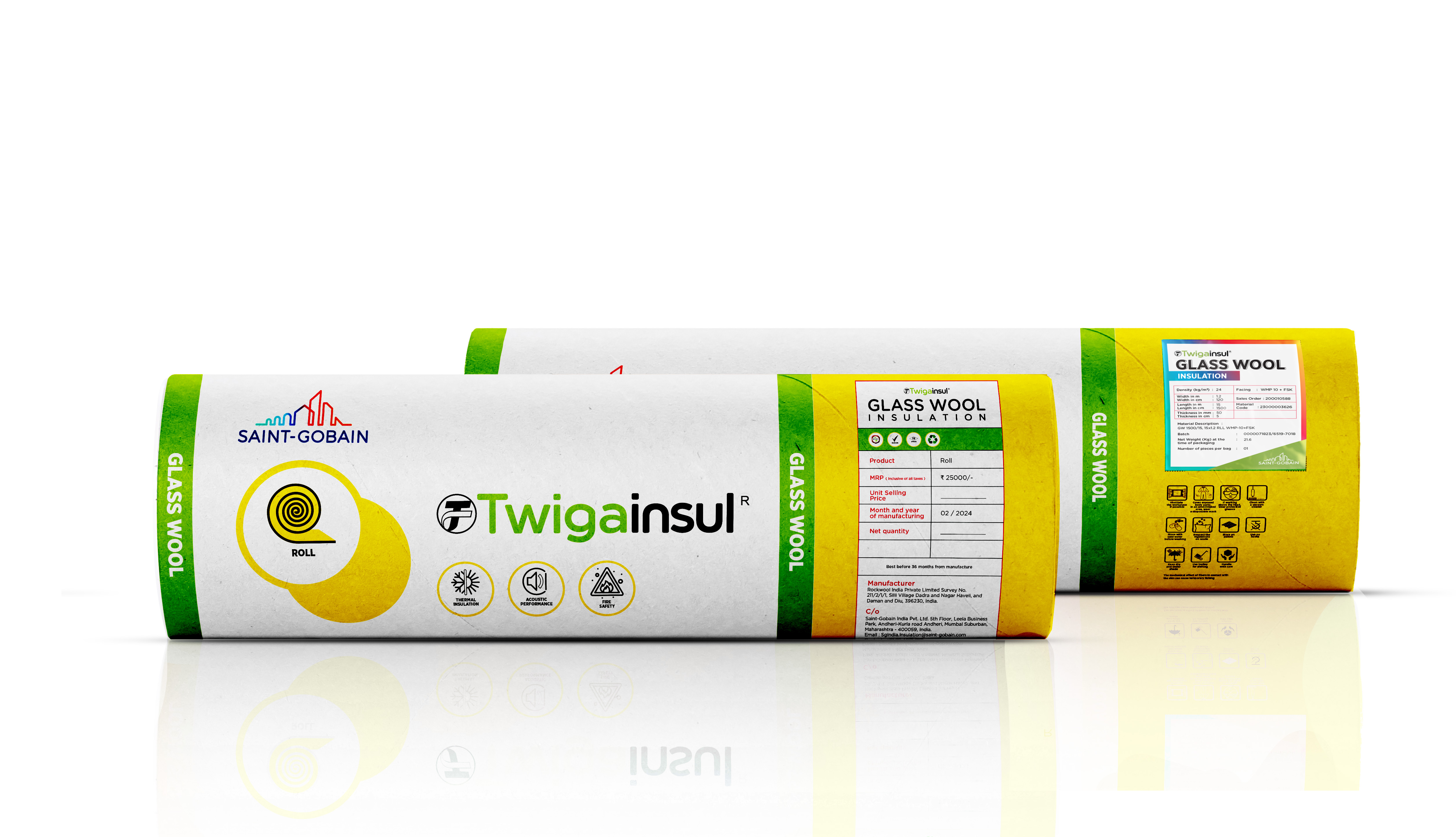
The result is a communication system that's more premium, structured, and visually engaging across brochure design, packaging design, exhibition stall design, and digital communication. It builds a stronger bridge between Saint-Gobain's global standards and its India-facing communication needs, improving consistency, raising the perceived value of products and services, and giving the brand a more contemporary customer experience across every touchpoint.
More Case Studies